Creating an intuitive, unified patient page for Liva Healthcare
Liva Healthcare, based in Denmark and the United Kingdom, has been a leader in digital therapeutics, focusing on behaviour and lifestyle changes to prevent and manage chronic cardiometabolic diseases globally. The company collaborates with the National Health Service (NHS) in England, Convatec, and Novo Nordisk.
To avoid sharing confidential information, I will not provide all the details of this project and its process. Information visible on the user interface are not real patient data.
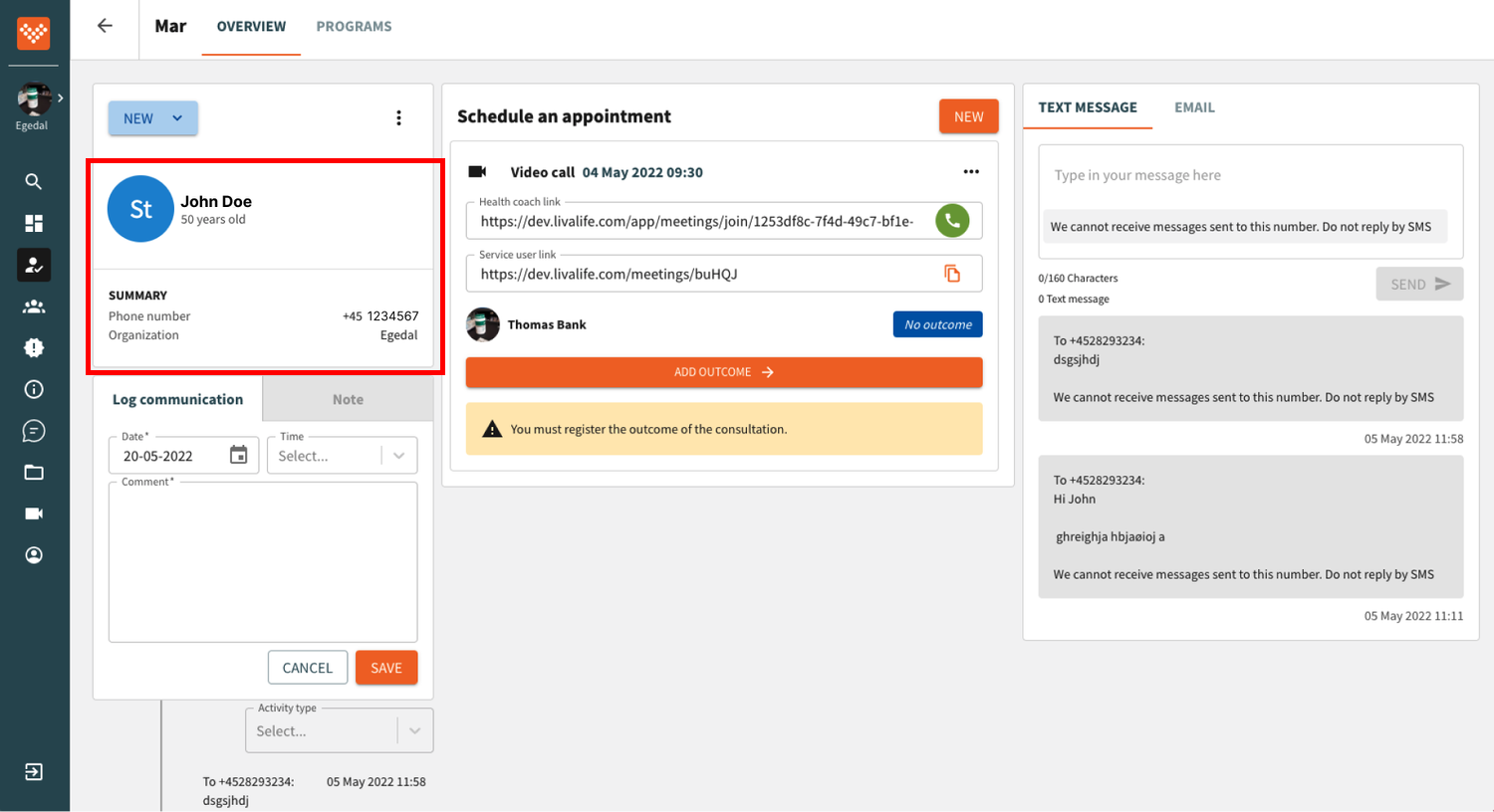
This case study outlines the development of a single patient page for Liva Healthcare, consolidating information previously scattered across multiple pages. Due to the project's extensive scope, I will outline the design process in high-level steps and present the design at the end of this page.
As a result:
94% of coaches reported finding it easy to use, according to a conducted survey.
Administrative tasks were reduced by 10 minutes, as observed with behavioral analytics tools.
92% of coaches successfully registered the outcome of video consultations using a new guided flow.
Observational study
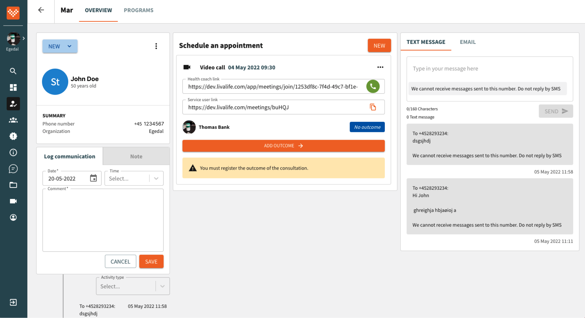
During my observation of five health coaches throughout their workday, I aimed to understand how they use the coaching platform while coaching a patient. What surprised me the most was the constant need for them to switch between browser windows. Patient information and various features were spread across different pages, leading to a cumbersome process involving extensive clicking. Moreover, during the video consultation with the patient, they had to manage a separate video call window. So while the coach was talking with the patient, she could not see the patient's information.
“It is just hard to listen to the patient, take notes, and switch between the pages”
“Sometimes I close the onboarding user page during the call because I don’t need it. But at the end of the call, I need to find it again to add the outcome of the video call.”
“It is hard to remember, which information I need to open when I need to find something.”
User journey map
To analyse the research findings effectively, I developed a user journey map structured around key workflows, such as sending interventions to patients or engaging in video calls with them. This map documents their behaviours, pain points, verbal expressions, and emotions throughout these processes. While it's important to acknowledge that not all issues have been resolved due to limitations and time constraints, the maps serve as invaluable tools for designers and teams. They allow us to perceive problems as part of a larger system and facilitate the process of breaking them down into manageable steps.
Translating research findings into user needs.
1. One Patient Page: Each patient should have a single, comprehensive patient page, streamlining information access and management.
2. Guided Administrative Flow: The administration process should be structured with a guided flow, facilitating smoother and more efficient completion of tasks.
3. Integrated Video Call Viewing: Health coaches should be able to view the video call with the patient while simultaneously navigating the patient page, enhancing their ability to engage effectively during sessions.
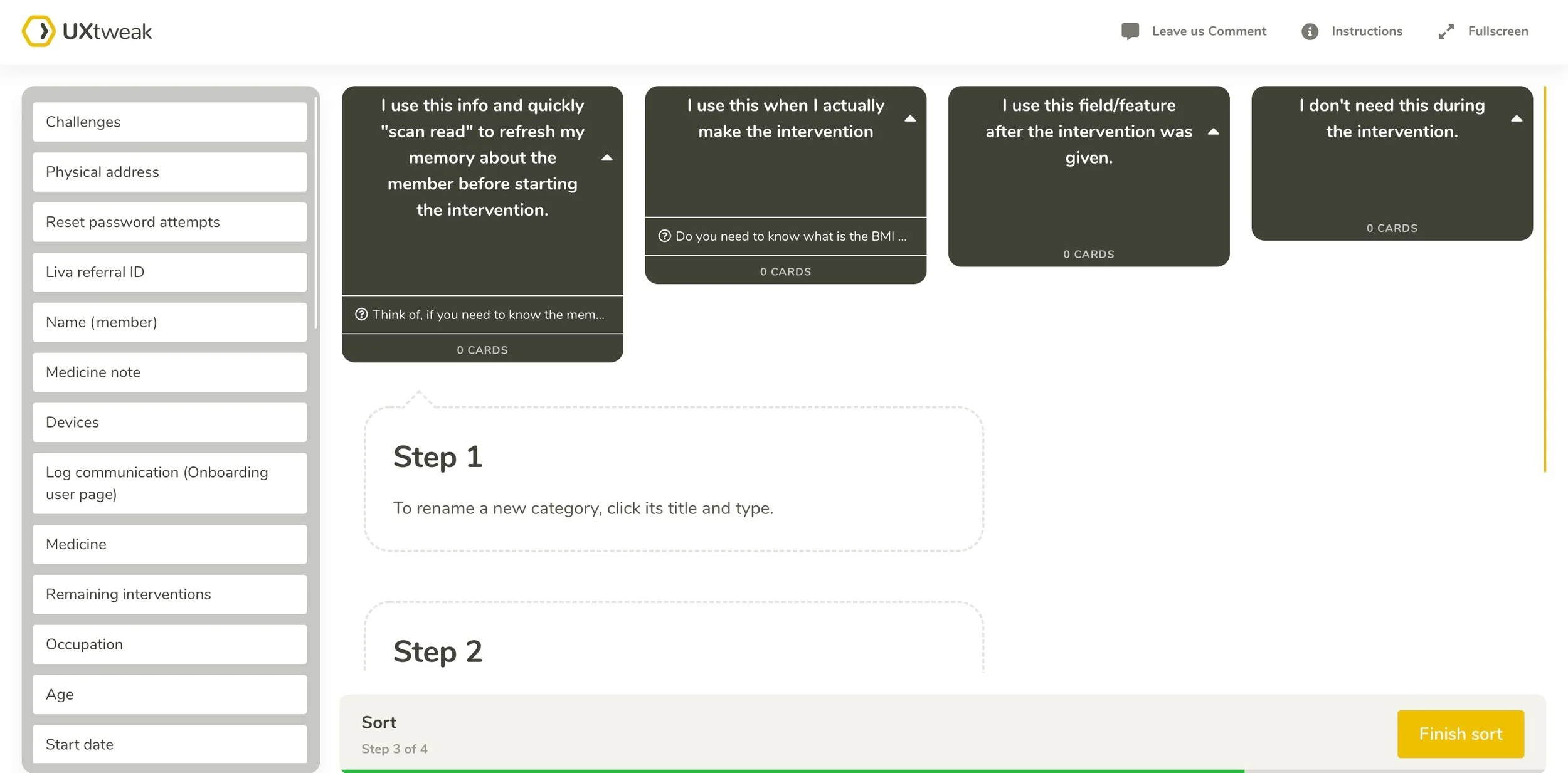
Card Sorting
Through multiple card sorting exercises, I gained valuable insights into how users naturally organise and prioritise information.
How do users prioritise frequent actions?
How do users sort information based on different workflows?
How do users group large amounts of information into categories?
What information do users not need?
User Testing
The design went through different versions based on user feedback, which I will not detail in this case study.
Final design
Notes Feature
The note entries and written notes are organised into one unified place rather than spread across four different pages. It's easy to access and switch between different note types.
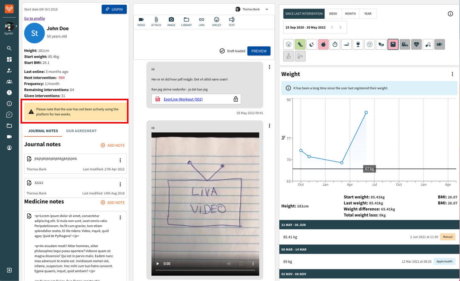
Alerts turned into reminders
The information the coach should remember was displayed as alerts across the pages. In the new design, these alerts are collected in one place as notifications.
Compare it with the previous design
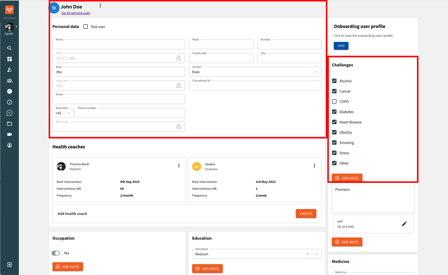
Patient information in one profile section
Based on card sorting with users, all information was collected under the profile section and categorized into logical groups.
Administration Flow
I identified multiple logical pathways to dynamically present the appropriate administrative flow based on the backend logic and user inputs. Because it is confidential information, the video below is just a simple presentation of the approach.
Easy access to patient data during the video call
The video call window opens on the member page and can be moved around on the page to access patient data.
Next: Increased User Engagement in the Liva app ➡️


